This content is provided by our partner Iterable. Iterable is a cross-channel platform that powers unified customer experiences and empowers marketers to create, optimize and measure every interaction taking place throughout the customer journey.
Content source: https://iterable.com/blog/a-look-back-at-the-best-emails-from-2021/
As one of the most impactful marketing channels, email deserves some time in the spotlight. In the past year, there have been some heavy-hitters in terms of effective email campaigns and we wanted to give credit where credit is due by highlighting some of the best emails from 2021. However, we want to call out that, for us, “best” doesn’t always mean the flashiest gifs or the funniest copy (although, that doesn’t hurt).
We’re thinking about “best” in terms of the customer experience. The emails we selected aim to improve the recipients’ interactions with the brands who sent them. Whether a welcome campaign or an abandoned cart campaign, the following examples know how to guide customers through their journeys in a personalized way.
Let’s see who made the cut.
1. Tuft & Needle
Starting off the best emails from 2021 is this abandoned cart email. Mattress brand Tuft & Needle thought about their messaging from the customers’ points-of-view. Mattresses tend to have a high price point, making it hard for customers to click “buy” online. Rather than trying to persuade customers to make a purchase by offering discounts, Tuft & Needle chose to educate the consumer, via an abandoned cart series, with the goal of making them more comfortable with the buying process.
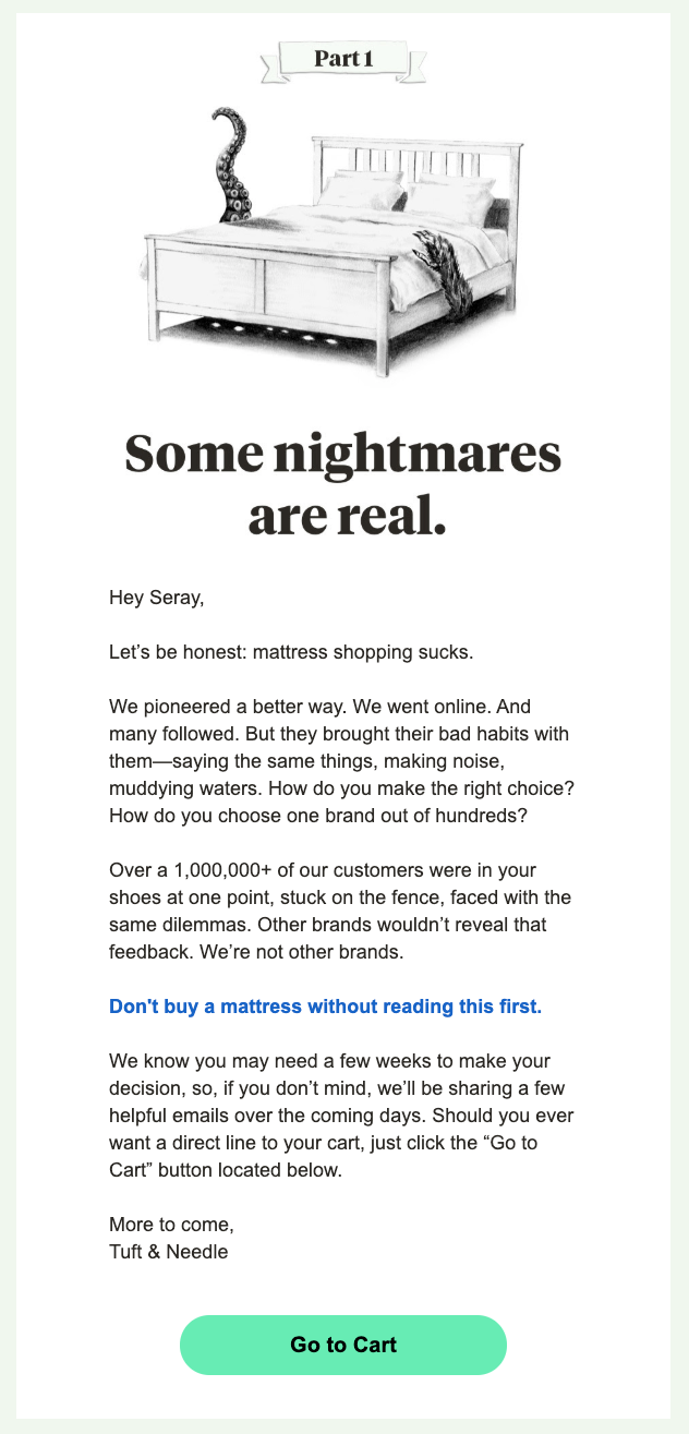
Not only is this email incredibly helpful for a customer who is debating whether or not to purchase, but it’s also personalized. The copy has the customer’s name, immediately communicating that Tuft & Needle is paying attention to, and values, each individual user.
2. Le Tote
In another non-salesly abandoned cart email, Le Tote, an online women’s clothing rental business, highlighted their number one value proposition up front. Le Tote recognized that when deciding to make an online purchase with traditional clothing retailers, shoppers may experience “buyer’s remorse,” or regret their purchase. But, because customers can rent clothes from Le Tote and return whatever they’re not planning to keep, they don’t have to worry about buyer’s remorse. Renter’s remorse isn’t a thing.
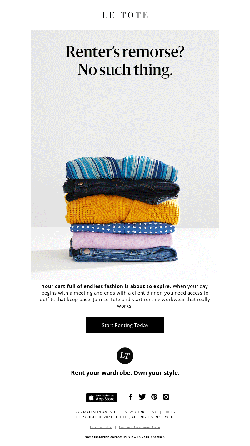
Then, the following copy and the CTA both draw more attention to the fact that the customer will rent the items in their cart, not purchase.
3. FabFitFun
Moving away from abandoned cart emails, we’re shifting focus to FabFitFun, a subscription box service, and their welcome email. The goal of this email is to get new members to purchase their first box and customize it to ensure they’ll like the products they receive. Right away, the copy makes it clear that this is a welcome email. But then, as an added bonus, FabFitFun offers a coupon plus a free gift—all above the fold.

As customers scroll down the email, they’re guided through the FabFitFun process. When offering a service that’s not a traditional retail exchange—like a subscription box—it’s beneficial to include:
- A breakdown of how the business model works. Step-by-step directions with photos can assuage customer concerns when approaching a process they’re not familiar with
- A non-committal CTA. The CTA in this email is “customize now.” Instead of leading the customer directly to purchase, it’s guiding the customer to look at the available options.
This welcome email isn’t a push to purchase, but a gentle, yet helpful, nudge.
4. Blue Bottle
With supply chain issues plaguing holiday shopping, Blue Bottle, a coffee roaster and retailer, wanted to get ahead of the panic. With this promotional email, Blue Bottle set clear expectations for customers. With a banner at the top, header copy, and body copy all clarifying the December 15th deadline, Blue Bottle wanted to ensure customers had the opportunity to get what they needed in time for the holidays.
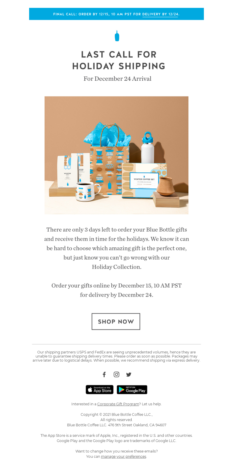
What we particularly like about this email is the lack of fluff. It’s a straightforward message, with pertinent information clearly stated. If a customer wasn’t placing an order because they weren’t sure if it would arrive by the holidays, they’ll place their order now.
5. Bokksu
Last but not least, we have Bokksu. Bokksu, a Japanese snack subscription box company, nailed their winback email. By incorporating FOMO (fear of missing out), Bokksu set out to show churned customers what they’ve been missing.

At the very top, there is a CTA to resubscribe. Bokksu wanted to give customers quick access to rejoining. Then, as customers scroll they can view some specific box themes. Each theme has its own CTA, so customers can examine each one more closely.
At the very bottom there is a CTA guiding users to see what the next box would be. We love this email because it combines value added for current customers with multiple ways to get churned customers back to the site. Offering a variety of paths not only increases the chances the customer will visit, but it also gives Bokksu additional customer data, based on which CTA they choose.
The Best Emails from 2021 Focus on the Customer Experience
The best emails from 2021 put the customers first. When designing effective email campaigns, it’s important to think about what a customer may need at each point in their journey. Why are they getting stuck at this stage? Do they need to do more research about a large purchase? Are they not sure if they’ll get an order in time?
Thinking about what additional information a customer needs at their individual bottleneck in the customer journey will help make your emails more impactful. Who knows, next year your emails could land on this list.
